What USD Investors Can Learn from Nifty & the S&P 500
When the S&P 500 has led the Nifty 50 (USD) for years, it can start to look … Continued
Read more25 May 2022
As the world stepped into the year 2020, we were hit by ‘Covid – 19’. While news agencies were predicting doomsday scenarios, stock markets seemed to be unaffected by it and kept making new lifetime highs. To curb the pandemic, nations imposed lockdowns in February and March, to which markets reacted sharply ensuing a global market crash.
Investors questioned:
The regular price action was of little help as the markets were making new highs.
Then a second set of questions arose:
The answer probably lies in using ‘Relative Strength Analysis’ (not to be confused with RSI – Relative Strength Index, another technical indicator). Relative Strength Analysis involves comparison of price movement of a particular stock or index v/s some other benchmark index or stock. The most common way of establishing Relative Strength is the ‘Ratio Method’ where the price of an instrument is divided by the price of another instrument and this calculated ratio is plotted on a chart.
RS of Nifty IT v/s Nifty 50 =NiftyIT/Nifty50
Sector specific risks can be highlighted using Ratio Charts. Once the risk is identified, one can lighten the positions in the weak sectors or avoid initiating new positions even if they are making new highs.
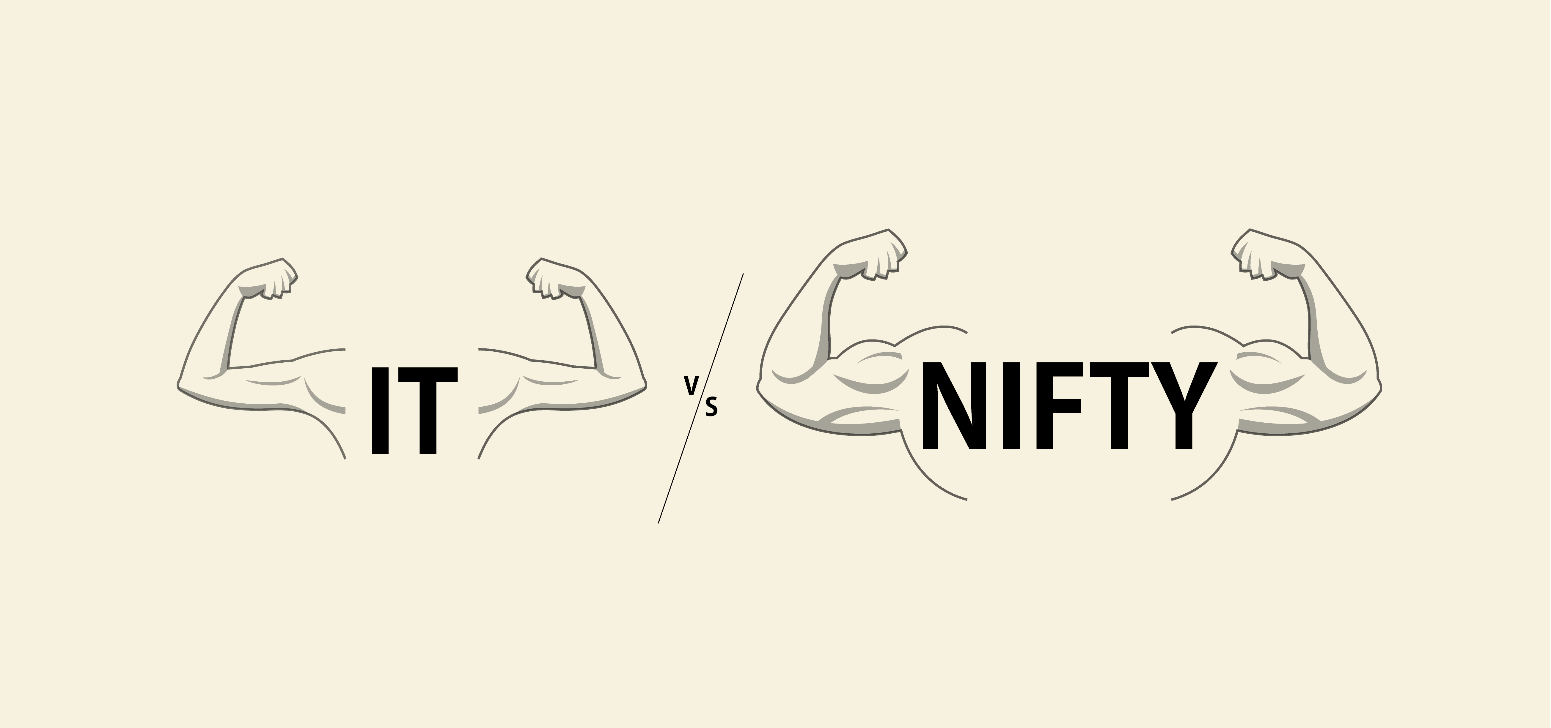
Let’s analyse Nifty IT as an example to understand how investors could have done this.
In February 2020, Nifty IT was making new lifetime highs. Despite this, the ‘Nifty IT/Nifty 50’ ratio chart was moving sideways showing no signs of emerging strength. The divergence in new highs of the index versus the lack of strength on the ratio chart indicated that one should be cautious as soon thereafter the index corrected.
Within the next 6 months, Nifty IT Index attempted to break its previous highs in July 2020. This time there was a clear sign of strength on the ratio chart. From July 2020 to January 2022 Nifty IT Index outperformed Nifty 50 by more than 50 percentage points.

In March 2017, another instance was found when the ratio chart helped sidestep a market consolidation. Nifty IT Index was in a down trend since peaking in March 2015. The Index had formed a ‘higher high – higher low pattern’, signaling the end of the downtrend while also breaking above the trendline. All the signals were indicating the beginning of an up-move in the sector however, the ratio chart did not reflect this optimism and was making lower highs.

The index went on consolidating for 8 more months till November 2017!
Between November 2016 and November 2017, the index was forming higher bottoms, indicating an uptrend. In November 2017, it broke the previous high while simultaneously the Ratio chart broke the trendline resistance. Between November 2017 and September 2018 Nifty IT index outperformed Nifty 50 by more than 30 percentage points.

However, one must remember that the Relative Strength Analysis is not a holy grail. There are instances when it has failed.
In February 2013, the Nifty IT index broke out of the consolidation, which was confirmed by break above the trendline resistance on the ratio chart. The breakout failed and the index declined back to the consolidation zone.
In July 2013, the index broke above the previous high confirmed by breakout on the ratio chart.

Relative Strength Analysis helped in managing trades in Nifty Metal Index in Jan 2020 when it briefly broke above the trendline resistance but there was no confirmation from the Ratio chart. The index broke the previous swing high in November 2020 with an additional confirmation of a breakout on the ratio chart. From the November 2020 breakout to January 2021 Nifty Metal outperformed Nifty 50 by more than 80 percentage points.

So far, the focus of the analysis was on a Macro/Sector level and one may ask how does the Relative Strength Analysis help in generating returns since one cannot directly invest in Sector indices (barring a few sectoral ETFs).
Let’s look at a similar analysis on a stock by using the Ratio Chart of the stock with Nifty 50 or its relevant sectoral index.
The IT index has been in an uptrend since forming bottom in March 2020 till January 2022. The index returned 221% from April 2020 to December 2021. However, TCS underperformed the index by more than 100 percentage points, generating 118% over the same period. Though the chart of TCS showed an uptrend, the ratio chart of TCS/Nifty IT was sloping downwards, indicating the underperformance of the stock v/s the sector index. By looking at the relative strength, investors could have possibly been ‘underweight’ on TCS or could have altogether avoided the stock in favour of some other outperforming IT stock.

So far, the discussion involved past examples, so let’s look at a live example.
Since the Covid Crash, Nifty IT index has been in an uptrend. In April 2022, the index broke below the previous swing low. At the same time, the ratio chart broke the trendline support. It appears that the relative strength is warning us that the IT index may underperform Nifty 50.

Does this warning of the ratio chart indicate a time to trim or exit our positions in the IT sector? Only time will tell…
When the S&P 500 has led the Nifty 50 (USD) for years, it can start to look … Continued
Read more
Enterprise SaaS is becoming a strategic necessity for India’s BFSI sector, with mid-sized institutions leading adoption while … Continued
Read more
Technology adoption in India’s BFSI sector is no longer only about digitisation. Enterprise Software as a Service … Continued
Read moreReceive monthly updates by signing up to our newsletter.
| Sr. No. | Received from | Pending at the end of last month | Received | Resolved* | Total Pending # | Pending complaints >3 months |
Average Resolution time^ (in days) |
| 1 | Directly from Investors | 0 | 0 | 0 | 0 | 0 | 0 |
| 2 | SEBI (SCORES) | 0 | 0 | 0 | 0 | 0 | 0 |
| 3 | Other Sources (if any) |
0 | 0 | 0 | 0 | 0 | 0 |
| Grand Total | 0 | 0 | 0 | 0 | 0 | 0 |
Number of complaints received during month against the IA due to impersonation by some other entity:
Note: In case of any complaints received against the IA due to impersonation of the IA by some other entity, the IA may adjust the number of such complaints from total number of received/resolved complaints while preparing the above table. Further, IA must close such impersonation related complaints after following the due process as specified by SEBI/ IAASB.
* Inclusive of complaints of previous months resolved in the current month.
# Inclusive of complaints pending as on the last day of the month
^ Average Resolution time is the sum total of time taken to resolve each complaint in days, in the current month divided by total number of complaints resolved in the current month.
| Sr. No. | Month | Carried forward from previous month | Received | Resolved* | Pending# |
| 1 | April, 2026 | 0 | 0 | 0 | 0 |
| 2 | May, 2026 | 0 | 0 | 0 | 0 |
| 3 | June, 2026 | 0 | 0 | 0 | 0 |
| Grand Total | 0 | 0 | 0 | 0 |
*Inclusive of complaints of previous months resolved in the current month. #Inclusive of complaints pending as on the last day of the month.
| SN | Year | Carried forward from previous year | Received | Resolved* | Pending# |
| 1 | 2022-23 | 0 | 0 | 0 | 0 |
| 2 | 2023-24 | 0 | 0 | 0 | 0 |
| 3 | 2024-25 | 0 | 0 | 0 | 0 |
| 4 | 2025-26 | 0 | 0 | 0 | 0 |
| Grand Total | 0 | 0 | 0 | 0 |
*Inclusive of complaints of previous years resolved in the current year. #Inclusive of complaints pending as on the last day of the year.